
Brand Identity
THEOS
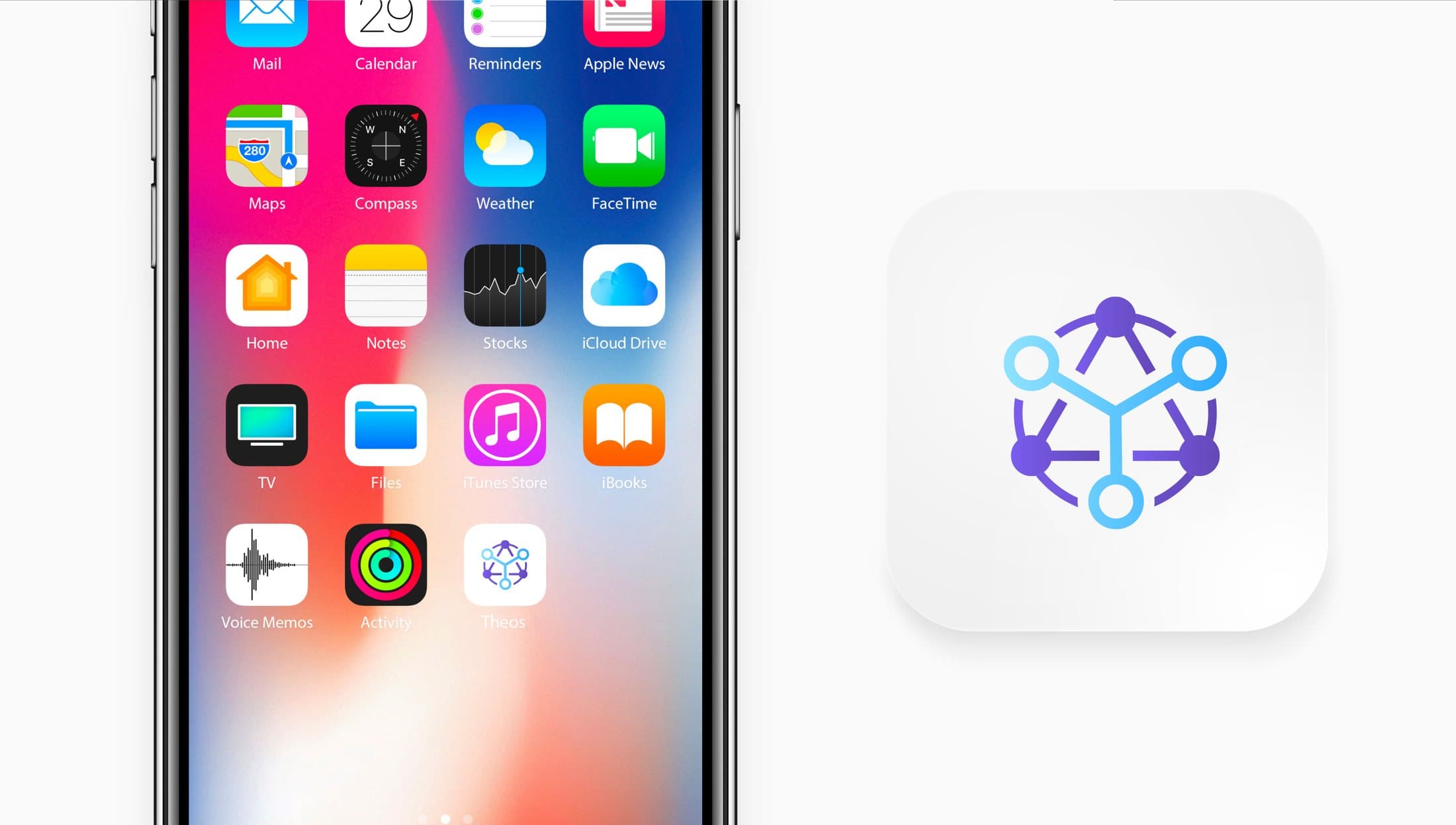
The THEOS crypto social app: a network symbol, a violet to blue gradient system, the app icon and a brand book written for developers.
- Category
- Brand Identity
- Focus
- Tech, App icon, Brand book
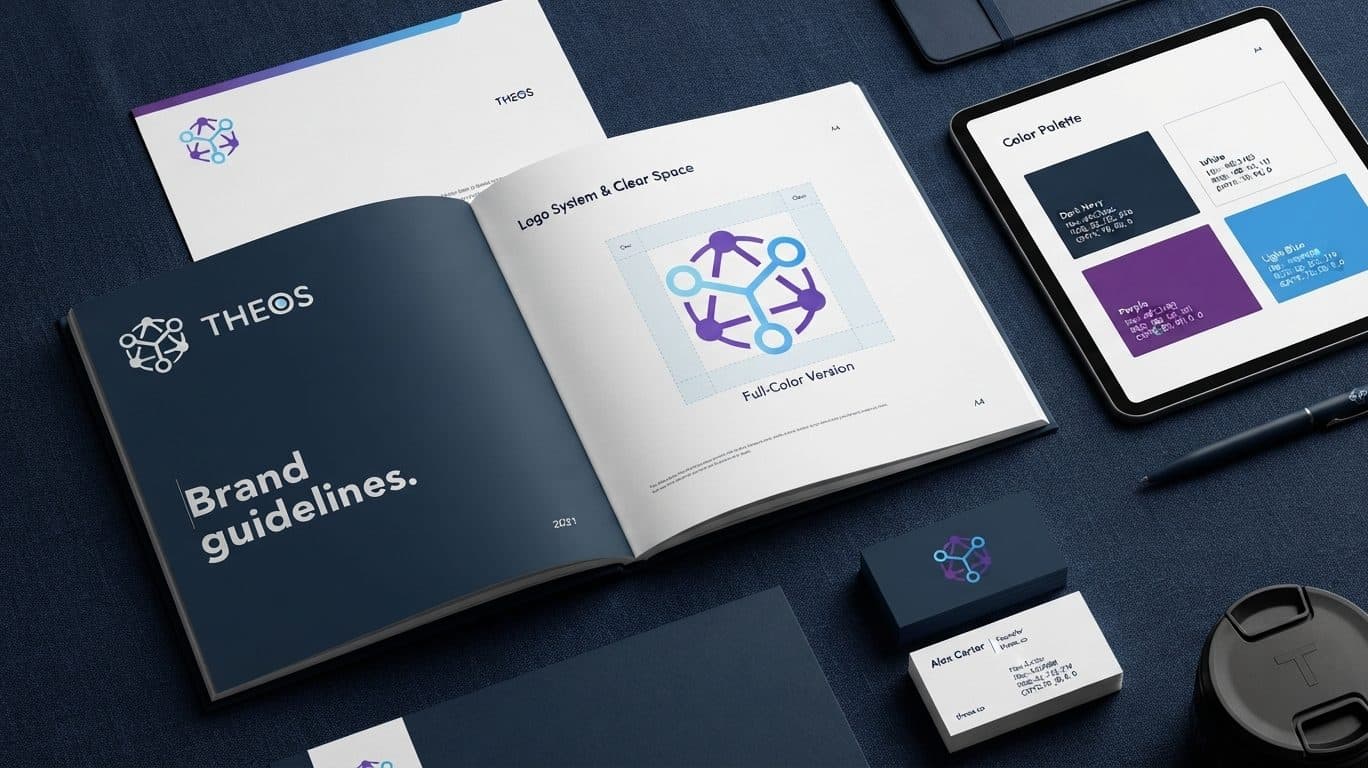
THEOS is a social app for crypto investors. We gave it a mark, an app icon and a colour system, documented in a brand book for the developers who would ship it.
The brief
The app was heading to the stores, so the identity had to be designed at icon size first and scaled up, not the other way round.
What we delivered
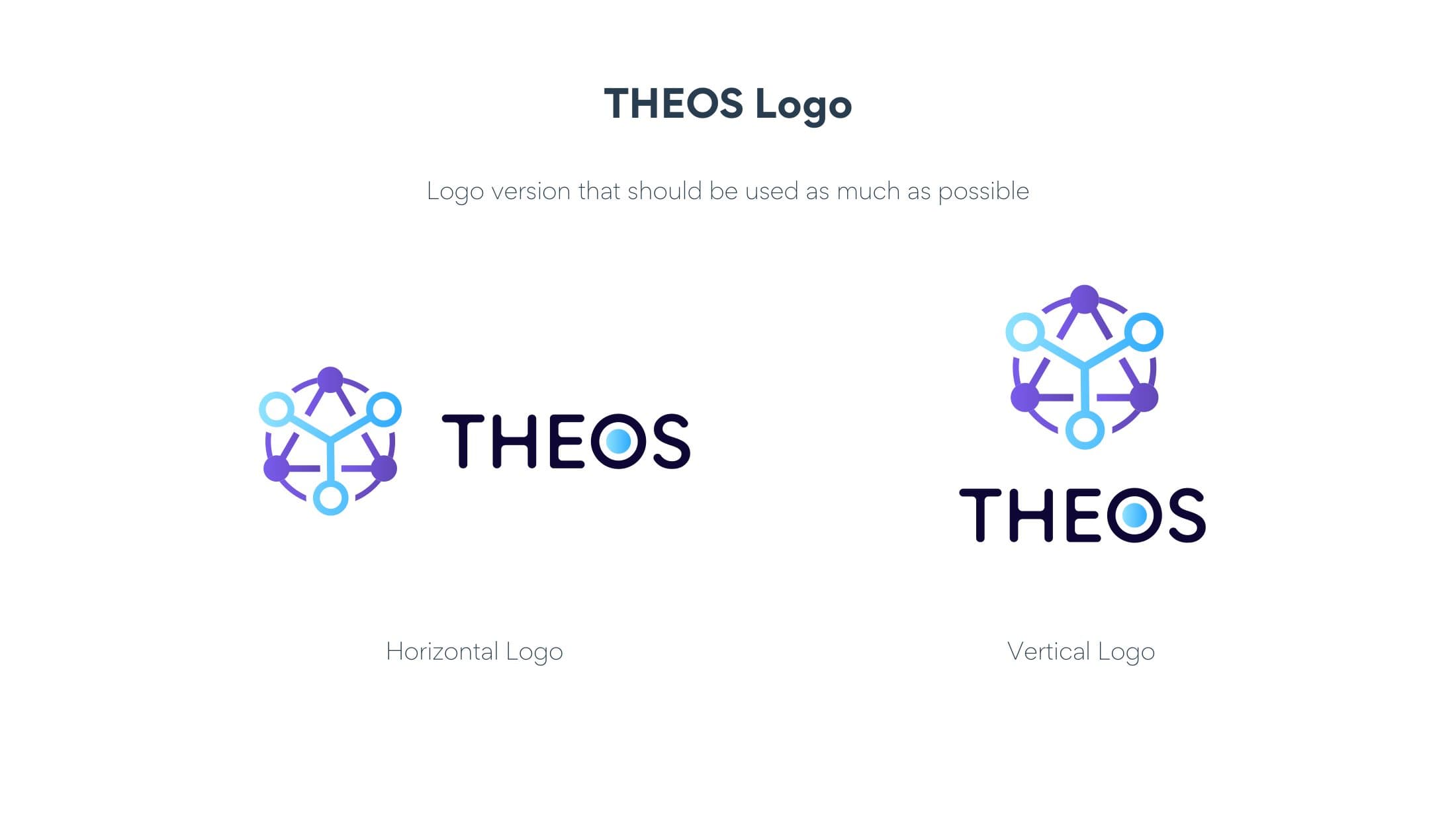
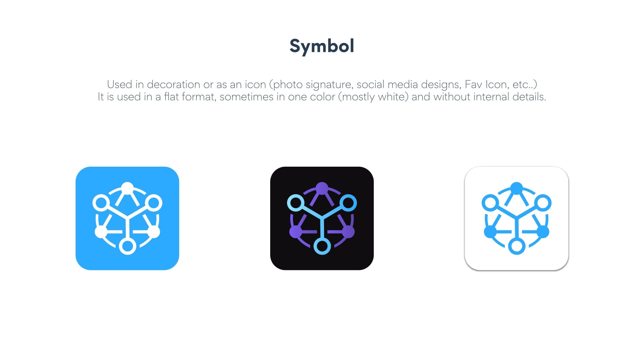
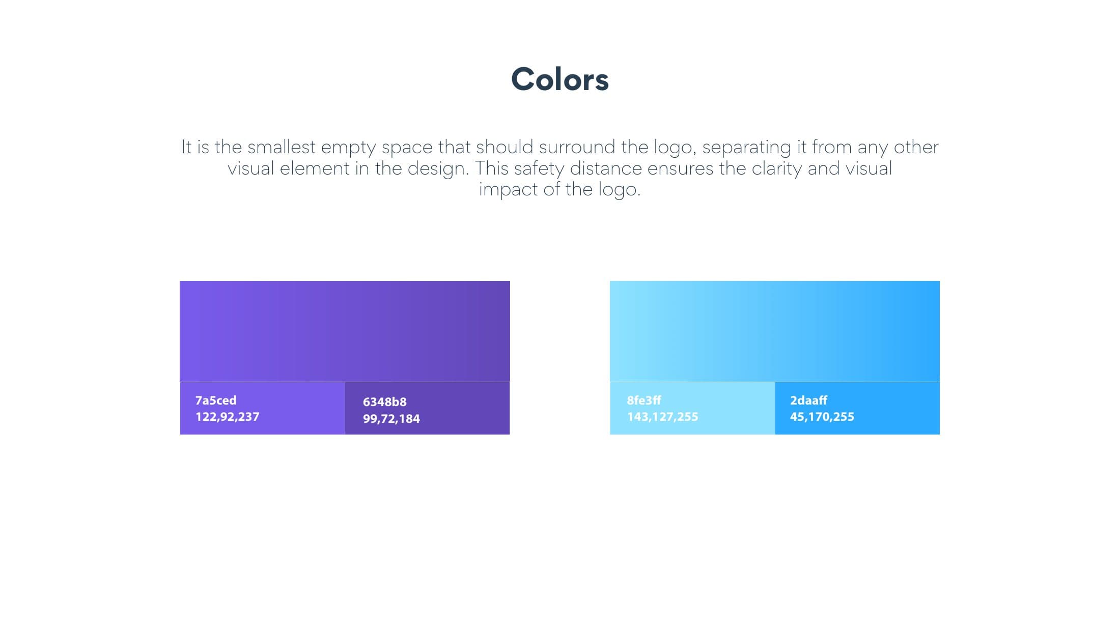
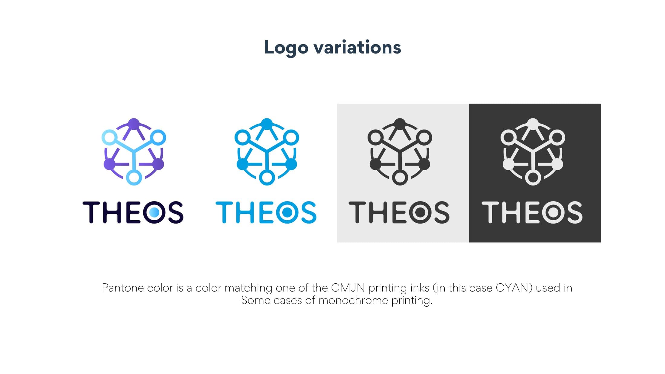
A network symbol, a violet to blue gradient system, horizontal and vertical lockups, monochrome and reversed versions, and the app icon for iOS and Android.
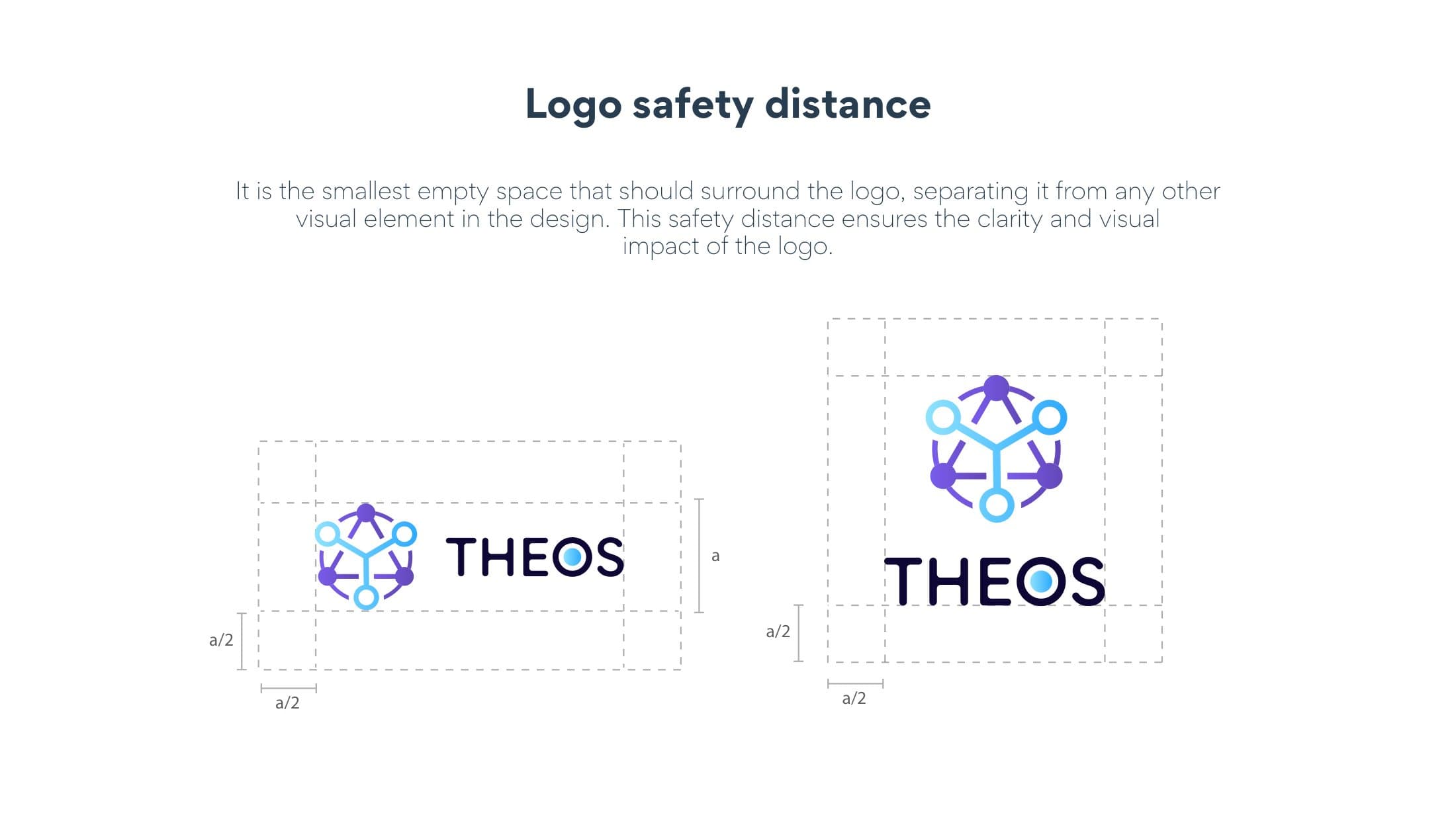
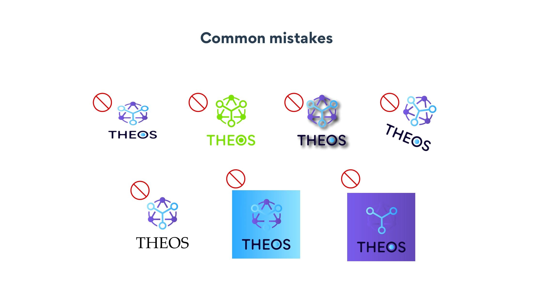
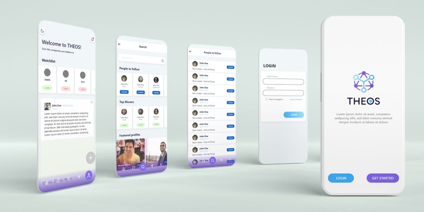
The brand book sets minimum sizes, clear space and colour values in developer terms, with a page of mistakes to avoid. We then carried the identity into the app's screens.
Why it works
Designing at icon size forced simple, high-contrast shapes; the same discipline made the symbol work on the dark interfaces where most crypto products live.
What we delivered
- Logo with icon-first construction
- App icons for iOS and Android
- Colour system and gradients
- Brand book
- App screens
Gallery
Related services
More in this category

A complete identity for an education academy: a mark that fuses the graduation cap, the open book and the rising sun, with an Arabic brand book, stationery and a social media kit.

Eagle-and-stars emblem, brand book, 3D signage, X-banners and a membership card system for a training company.

A lighthouse built from the Arabic letters of the name, five colour-coded sub-brands, an icon family, façade signage and a full stationery set.

Have a project? Let's write the first line.
Messages sent from the website: we reply within one business day.