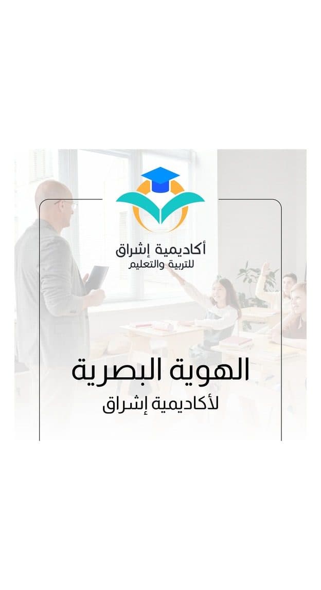
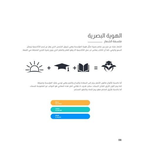
Ishraq Academy needed an identity that reads as an academy at first glance and works just as well on a school gate as on a phone screen. We designed a mark that fuses three ideas, the graduation cap, the open book and the rising sun, and built a complete Arabic-first system around it.
The brief
A private academy for tutoring and exam preparation, competing with older institutions, wanted to look established without looking old. The name, Ishraq, means sunrise, which gave us the visual anchor for the whole identity.
What we delivered
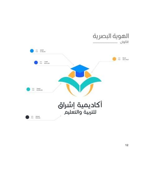
A primary logo with Arabic and English lockups, a symbol that stands alone on social avatars and signage, a warm palette led by teal and amber, and a full Arabic brand book covering clear space, minimum sizes, colour values and common mistakes.
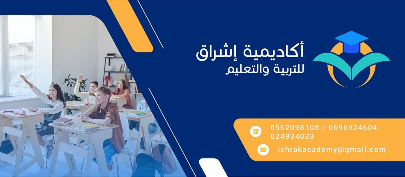
The rollout included stationery, business cards, a Facebook cover, post templates and a profile picture set, so the academy could go live on every channel the same week.
Why it works
Every element scales: the symbol stays legible at 16 pixels, the Arabic wordmark keeps its rhythm at banner size, and the colour pairs pass contrast checks on both light and dark backgrounds.
Gallery
What we delivered
- Logo, symbol and bilingual lockups
- Arabic brand book (PDF)
- Stationery and business cards
- Social media covers and post templates
- Source files (AI, SVG, PNG)