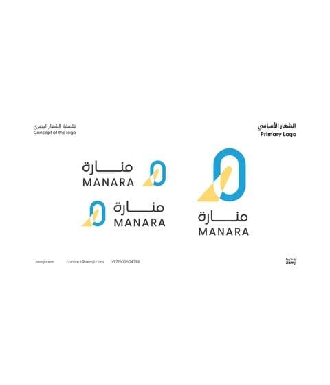
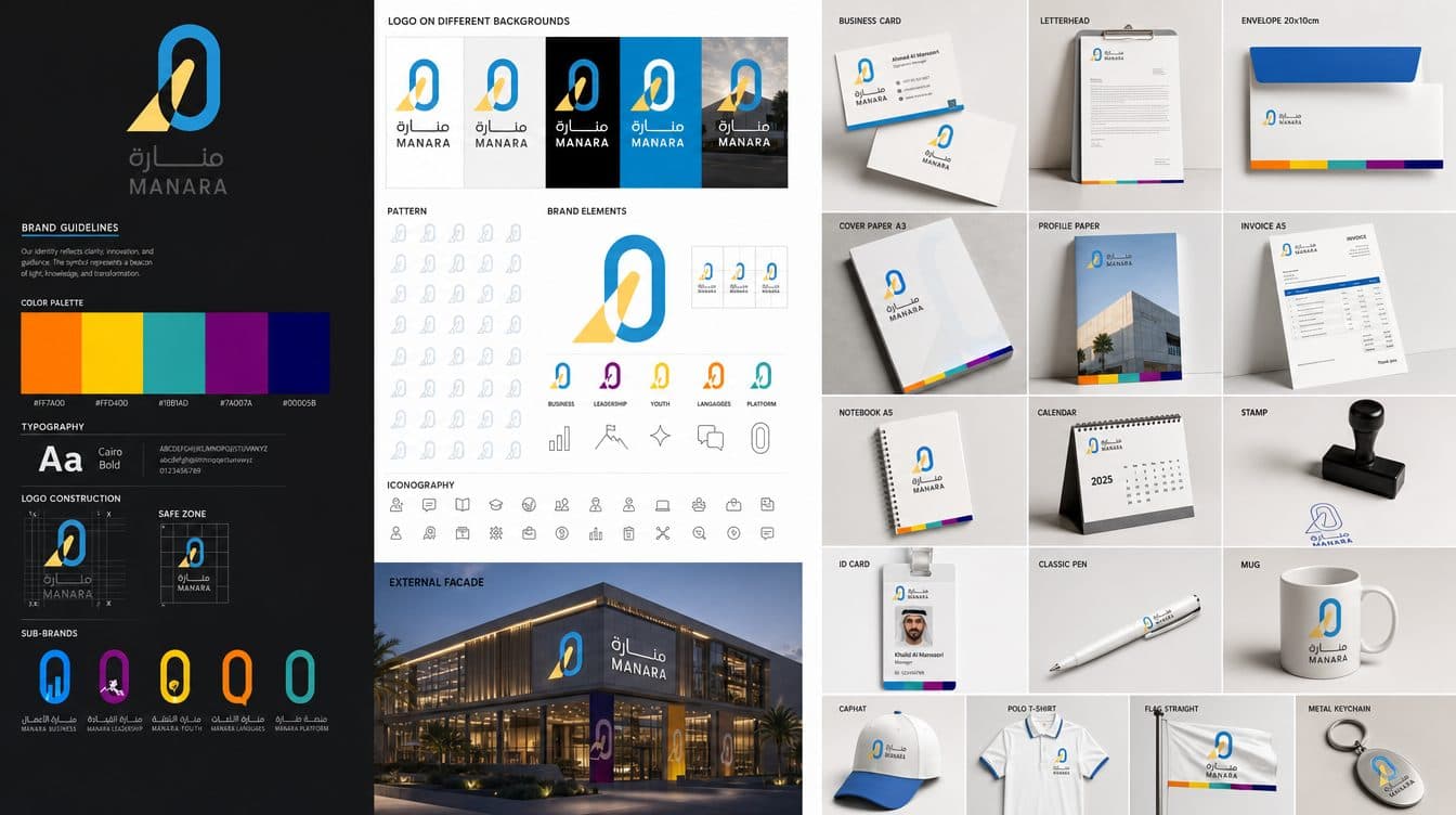
Manara means lighthouse. We built the mark from the Arabic letters of the name so that the symbol is literally the word, then gave the academy five colour-coded sub-brands for business, leadership, youth, languages and its online platform.
The brief
An academy launching several programme tracks at once needed a parent brand strong enough to hold them together and flexible enough to let each track own a colour.
What we delivered
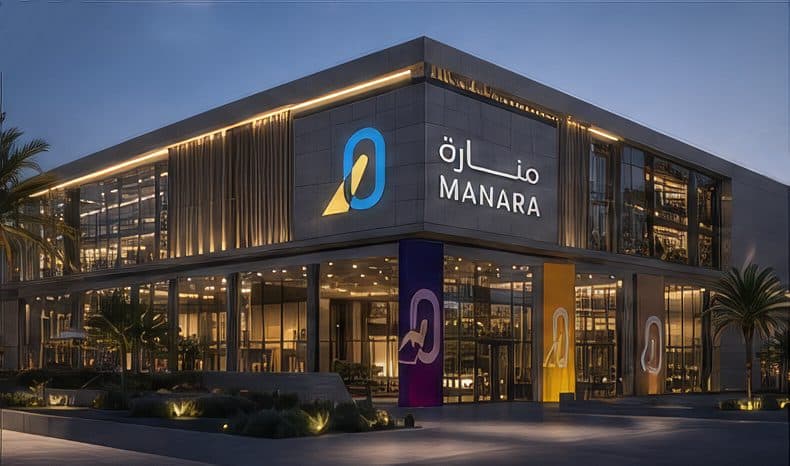
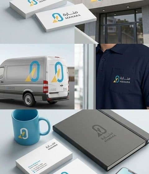
The primary logo and its Arabic and English lockups, the sub-brand system with a dedicated hue and icon per track, a geometric pattern derived from the lighthouse, façade signage and a complete stationery set from letterhead to mugs.
A concept presentation walked the client through the logic of the mark, so the team could explain the identity to partners in their own words.
Why it works
The sub-brands share one skeleton and differ only in colour, which keeps the family recognisable while a parent, a teenager and a corporate client each find their track instantly.
Gallery
What we delivered
- Primary logo and bilingual lockups
- Five colour-coded sub-brands
- Icon family and pattern
- Façade signage design
- Stationery set and mockups