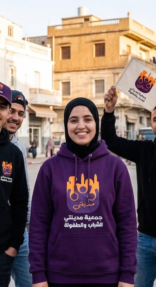
Madinati is a youth and children's association. The old identity looked like a municipal stamp; the new one looks like something a teenager would wear, because that was the measure of success.
The brief
Recruit and keep young volunteers. The association needed a brand that its members would be proud to show on the street, not only on official letters.
What we delivered
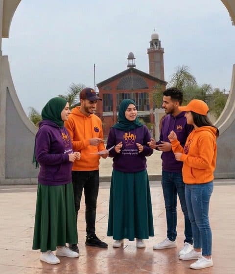
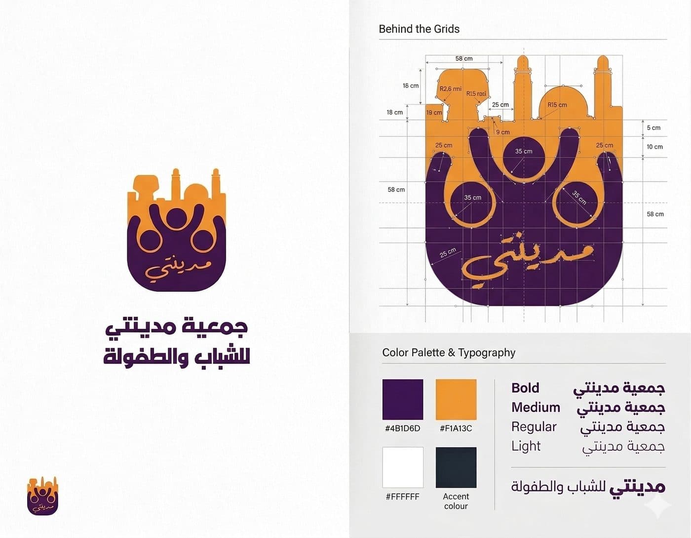
A warm, human logo built from figures in a circle, a bold orange-and-plum palette, the Arabic wordmark, the full stationery and document set the association needs for its administrative life, and a merchandise line: hoodies, caps and tote bags.
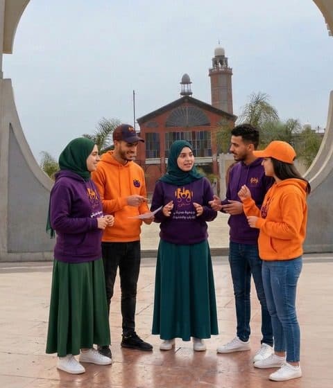
Photography sessions with real members turned the merchandise into the brand's best advertising.
Why it works
The logo reads at both extremes: as an official seal on a certificate and as a bold print on a hoodie. That range is what let a traditional association become a youth brand.
Gallery
What we delivered
- Logo and Arabic wordmark
- Colour palette and typography
- Stationery and official documents
- Merchandise line
- Brand photography