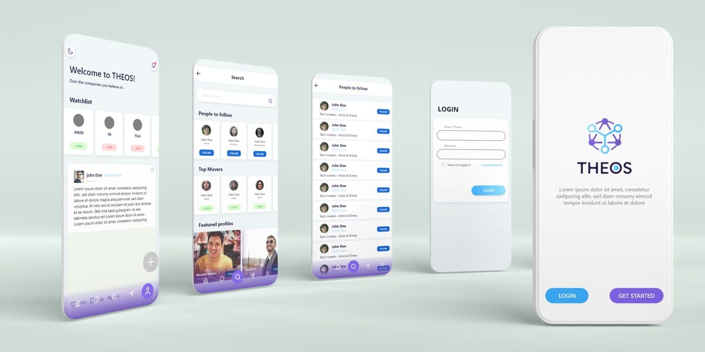
One client group, two products that could not look alike: THEOS, a social app for crypto investors, and Queekly, a queue-management product for shops and clinics. We gave each a mark, an icon and a colour system, documented for the developers who would ship them.
The brief
Both products were heading to the app stores, so the identities had to be designed at icon size first and scaled up, not the other way round.
What we delivered
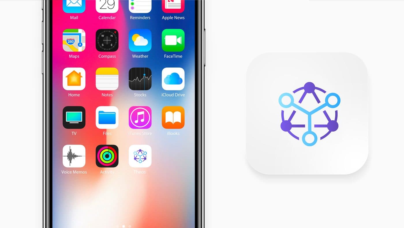
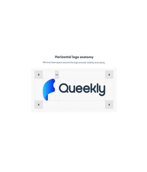
For THEOS, a network symbol, a violet-to-blue gradient system, the app icon and the full screen set of the social feed, watchlist and login flows. For Queekly, a friendly speech-bubble mark, a logo anatomy sheet and a brand book in English.
Both brand books specify colour tokens and spacing in developer terms, so the design system and the codebase speak the same language.
Why it works
Designing at icon size forced simple, high-contrast shapes; the same discipline made the marks work on dark interfaces, where most crypto and dashboard products live.
Gallery
What we delivered
- Two logos with icon-first construction
- App icons for iOS and Android
- Colour systems and gradients
- THEOS screen set
- Queekly brand book