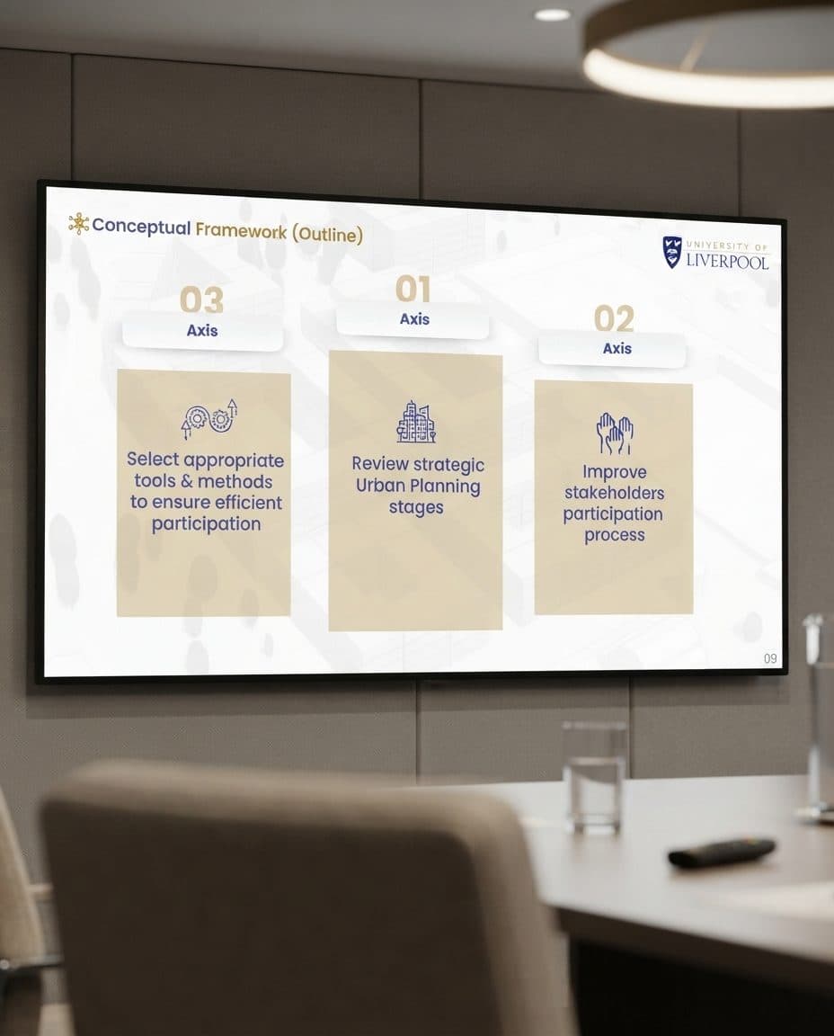
A good deck makes a complicated argument feel simple. These slide systems were built for an academic urban-planning study, a training company's programme catalogue and a food-contracts marketing plan, each with a grid that survives the client editing it later.
The brief
Three very different audiences, one problem: dense content, short attention, and slides that would be edited by people who are not designers.
What we delivered
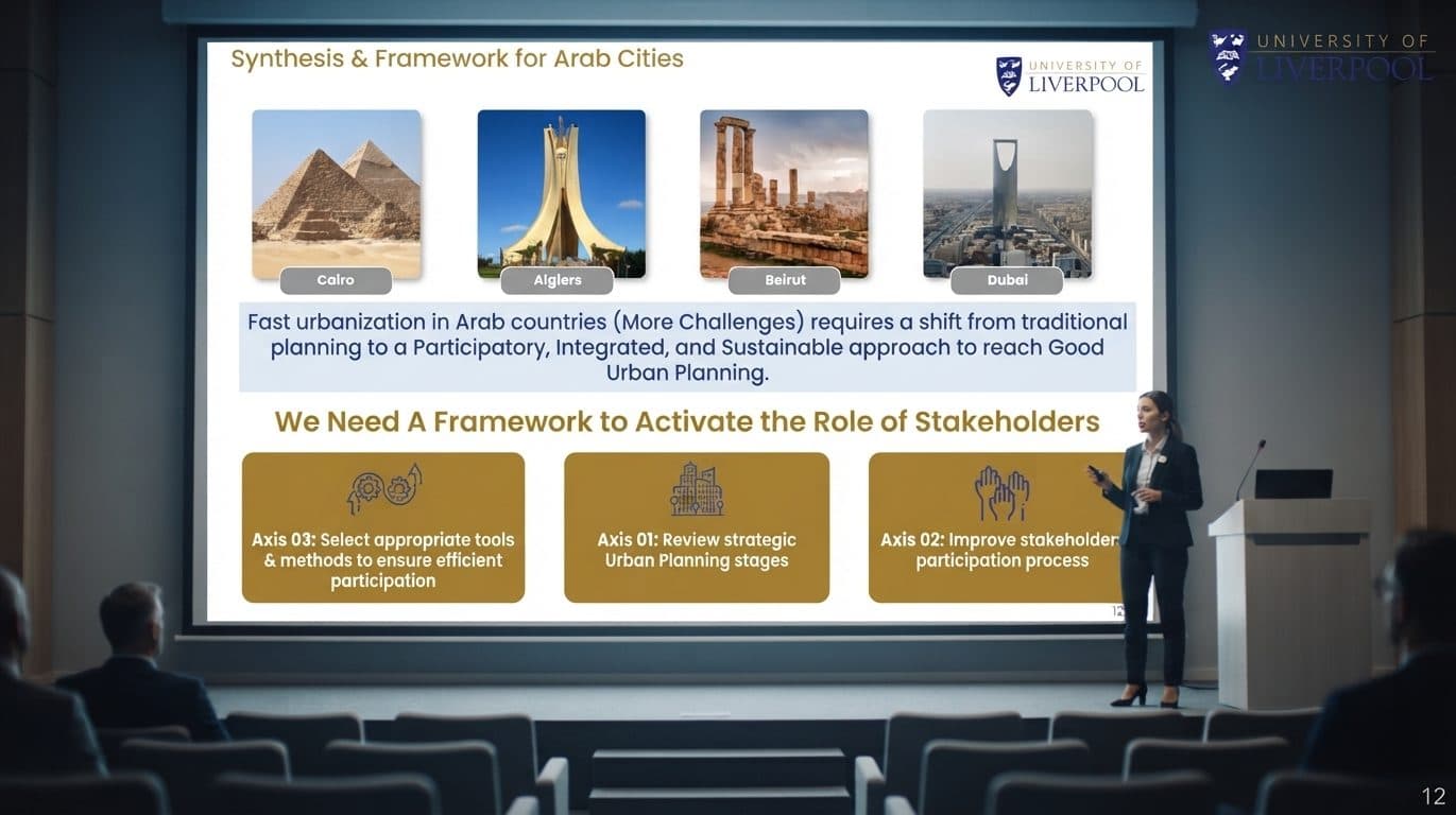
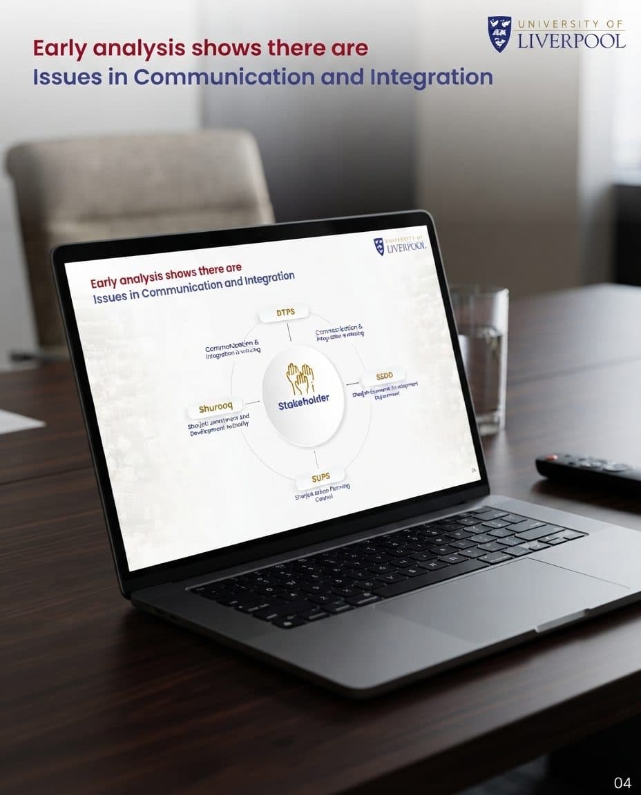
For the University of Liverpool research deck, an infographic language for frameworks, timelines and heat maps that turns pages of analysis into one readable slide each. For UMT, a bilingual Arabic-English deck of training programmes. For the food-contracts company, a marketing plan with a clean chapter structure.
Each system comes with master slides, colour and type styles, and a short guide, so new slides added months later still look like part of the deck.
Why it works
We design the template around the worst slide, the one with the most text, so that everything else has room to breathe.
Gallery


What we delivered
- Slide master and layouts
- Infographic and chart styles
- Bilingual RTL/LTR variants
- Icon set
- Editing guide for the client team